Flipkart Co-Branded Credit Card
Making credit and retail more inclusive in India by partnering with Axis Bank and Mastercard to launch a co-branded credit card.
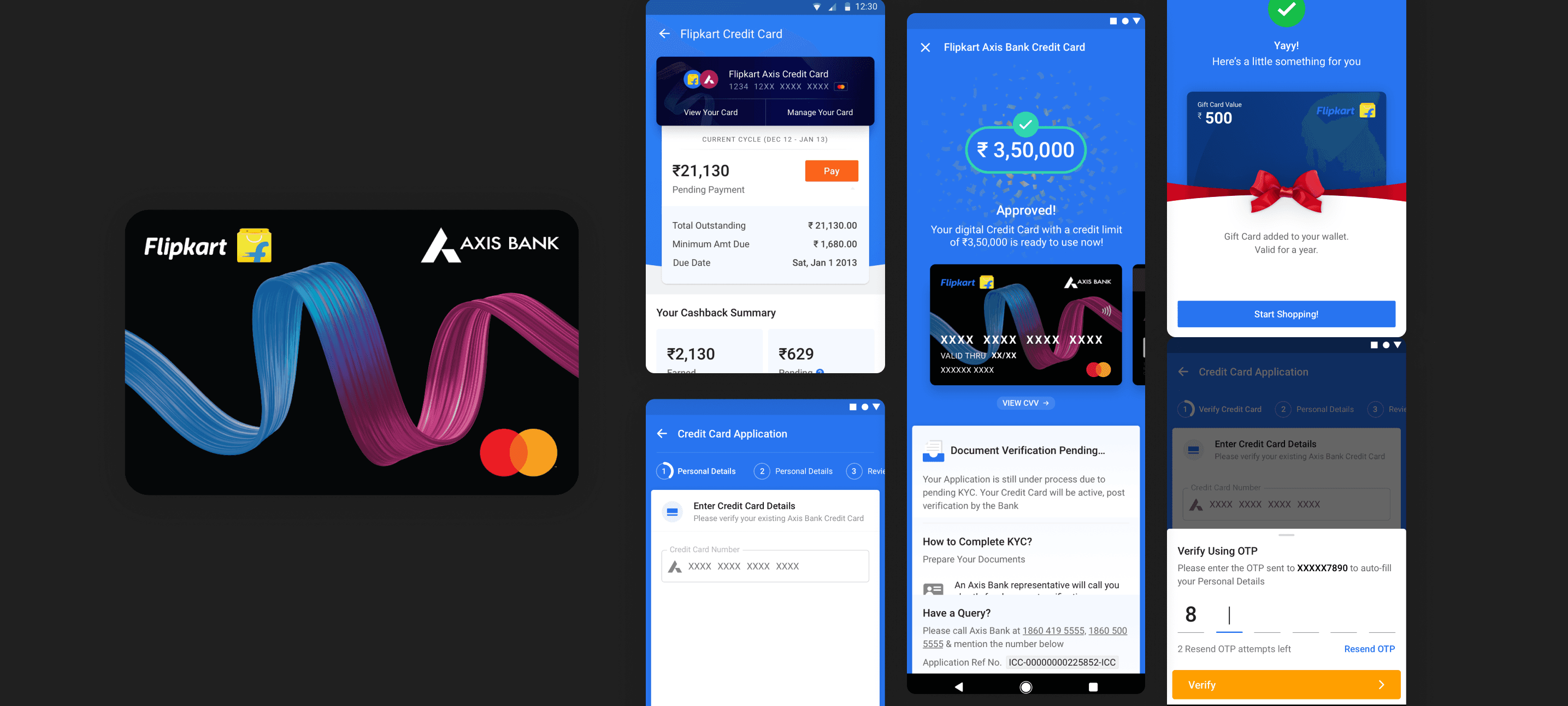
The Flipkart Axis Bank Credit Card is a co-branded credit card (CBC) offered in partnership with Axis Bank and Mastercard. Its goal is to achieve "top of wallet" status, making it the preferred credit card for customers over competitors' cards, and to drive loyalty and repeat purchases on the Flipkart’s e-commerce ecosystem. Moreover, the credit card was designed to serve as a critical bottom line driver for Flipkart, and to increase access to credit in India, where only 3% of the population has a formal credit card.
Catering to the previously excluded audience meant that the product had to be designed for a cohort that was relatively new to the internet era and was likely to be using their mobile phones as their primary means of accessing the internet. This population segment has been excluded, underserved, and disempowered until now. Thus, it was important to recognize that context is invaluable in all situations where technology is being distributed.
As a product designer, I was responsible for designing the lead generation and credit card console designs, which were critical to the success of the program. Prior to the launch of the credit card, I conducted usability field research to better understand the needs and preferences of potential users. Through this research, I learned that as a designer for mass-market financial products, I bear a strong responsibility to create trustful transactions/transactional behavior amongst customers, while still staying true to product and growth KPIs.
After almost seven months of intense development and preparations, the Flipkart Axis Bank Credit Card was finally launched at a highly-anticipated public media event in Mumbai, India's dynamic financial capital. The launch was an unprecedented success, with the card issuing an impressive 890,000 cards in its first year. Now, after only a couple of years, the card has reached a staggering two million card issuances, with a wide regional distribution spanning over 18,000 pin codes across India. This incredible feat has made the Flipkart Axis Bank Credit Card one of the fastest co-branded credit cards to reach such a significant number of card issuances, proving its immense popularity and resounding success.
What is a CBC?
A co-branded credit card (CBC) is a Joint Payment Proposition between a retail merchant (Flipkart), bank (Axis Bank), and a card network (Mastercard, Visa etc.)
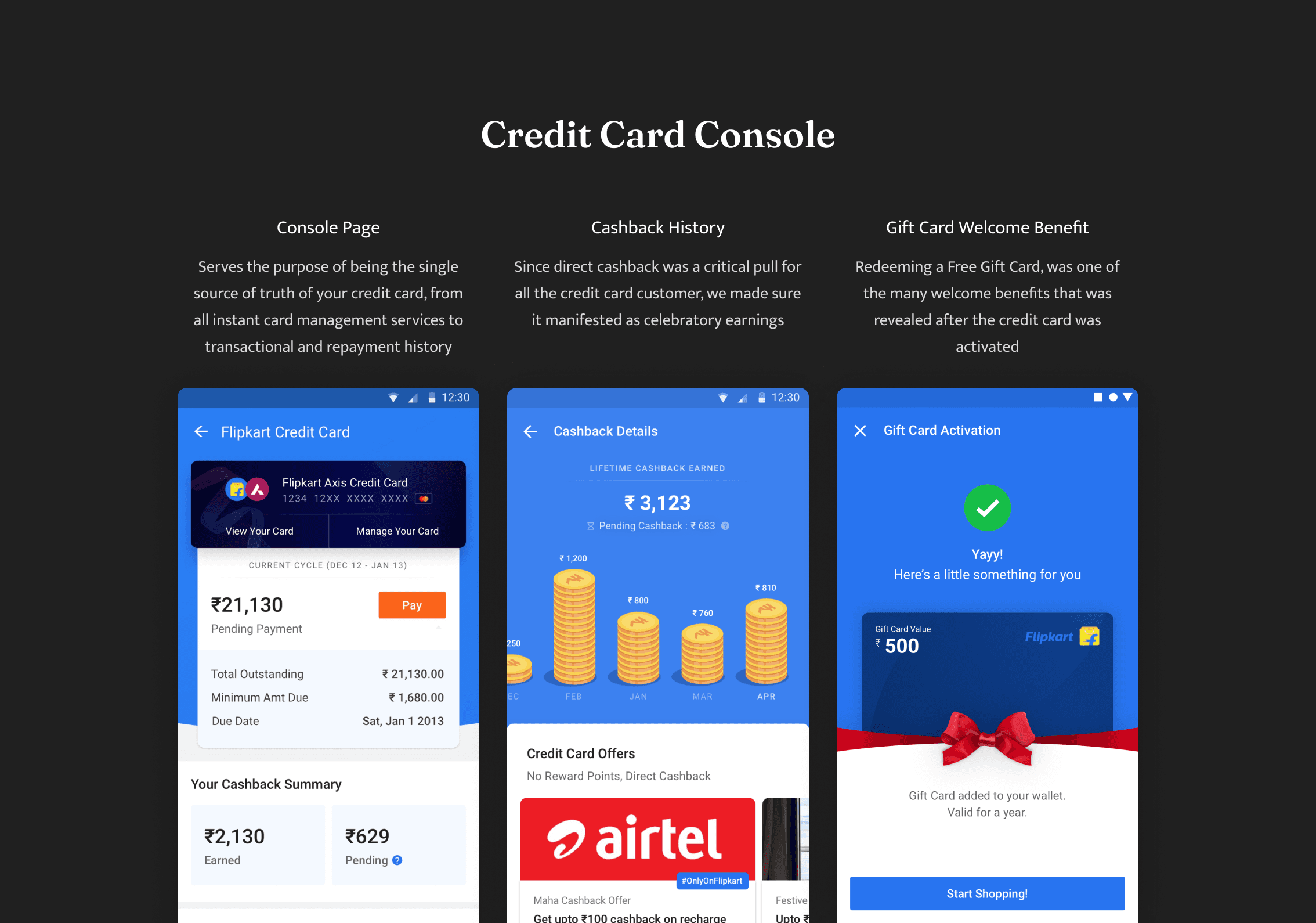
Co-branded Credit Cards programs have accelerated benefits offering the card (on the earn side, burn side or both) and is a widely used tool to drive loyalty and repeat purchases. One can earn reward points with each purchase you make, big or small. In the Flipkart co-branded credit card, Rewards = Cash which was directly subtracted from your bill amount at every month.
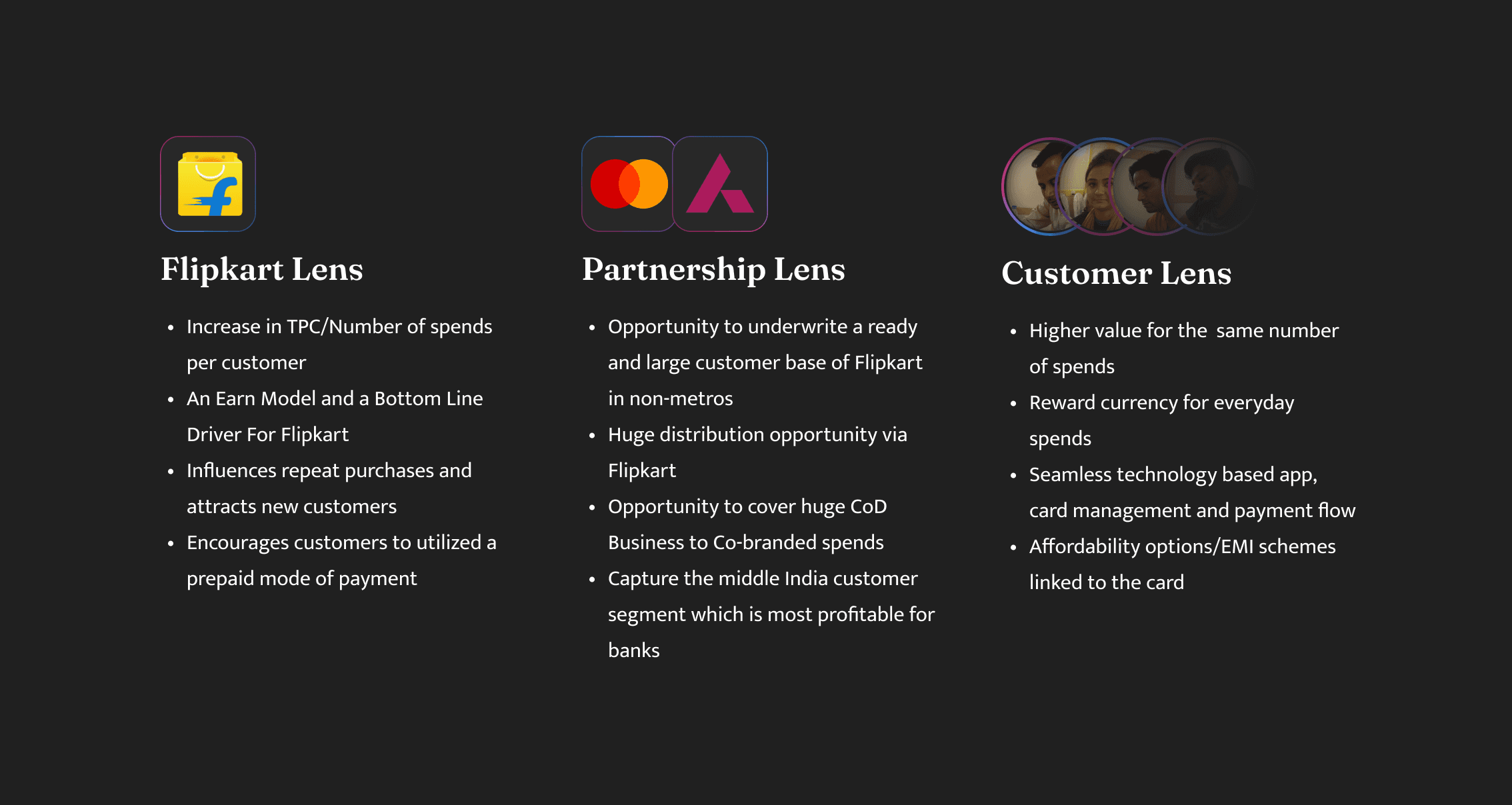
For a bank such as Axis a joint partnership with a leading online retailer such as Flipkart meant they could leverage our data and technology for a superior reach and adoption to their credit card portfolio. This partnership allowed us to build a product on four key pillars:
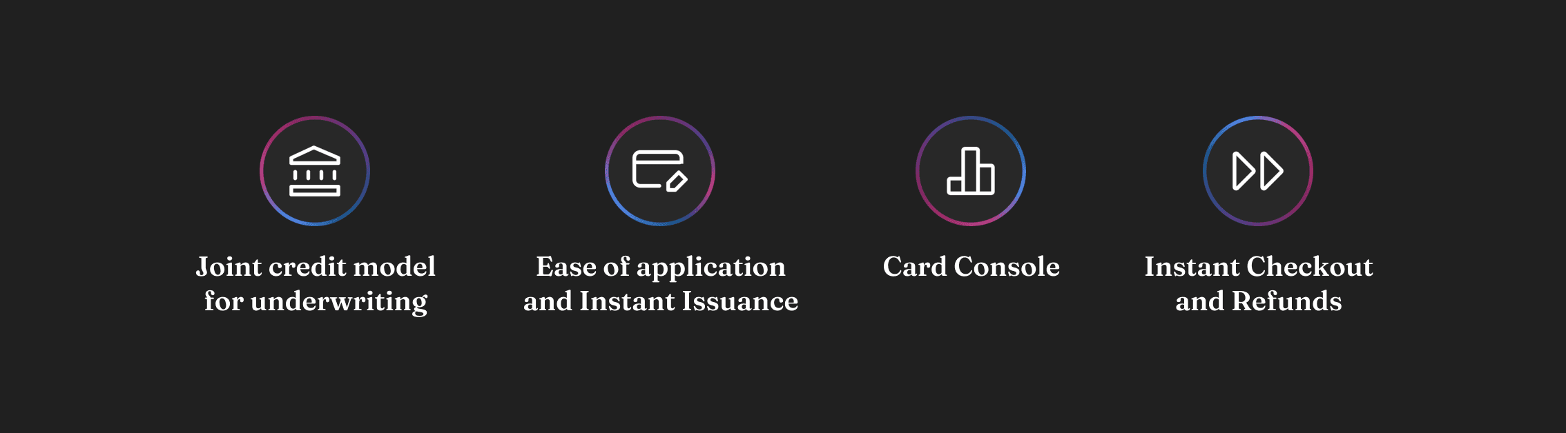
1. Joint credit model for underwriting - By leveraging the alternative data available with Flipkart, Axis Bank and Flipkart looked to establish a joint credit model, which would not only expand their offer base but also increase the repeat purchase behavior of customers, as measured by the number of products purchased per customer, and alter the payment behavior of customers from cash to card.
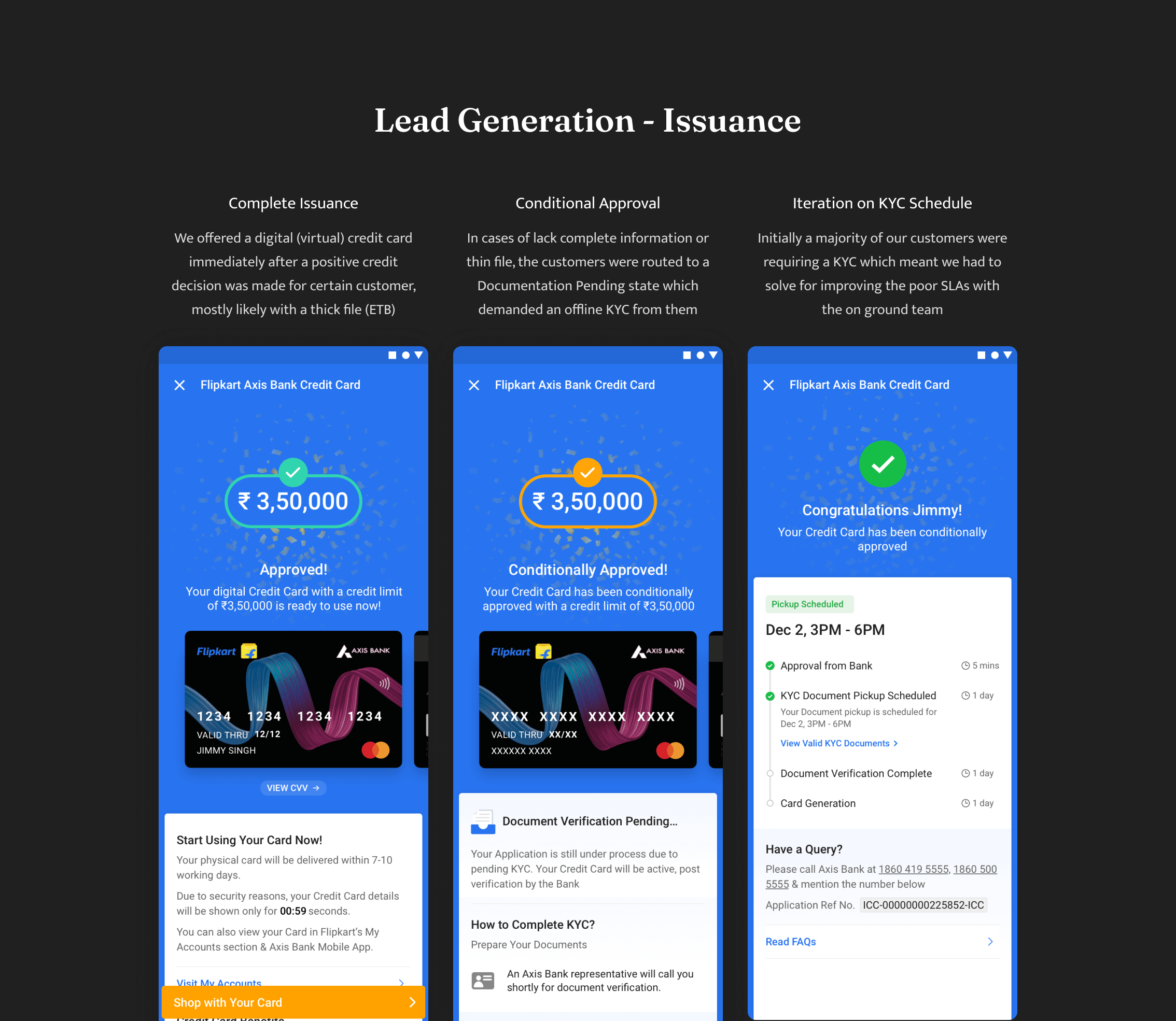
2. Ease of application & Instant Issuance - Pre-filled forms using data fetched from Axis Bank, along with an instant virtual card experience, would help reduce the cost of acquiring customers, as well as providing immediate activation and utilization of their credit line. This would be a major benefit to consumers, as it would take away the hassle of filling out lengthy forms and waiting for credit approval. Additionally, the virtual card experience would provide a seamless, secure, and convenient experience, allowing customers to access their credit line quickly and easily.
3. Card Console - Card management is made easy with the introduction of the virtual card and card service feature on the Flipkart App. Users can now access their card statement summary with ease, which includes information such as due date, due amount, cash back summary, and a view of their lifetime earnings. The Flipkart App would become their single source of truth for all card related activity - allowing users to keep track of their payments and expenses with ease, providing an easy and convenient way to manage their cards and finances. Furthermore, it would also provides users with an insight into their spending habits, enabling customers to plan and budget more effectively. As a result, customers could make better-informed decisions and be more financially secure.
4. Instant Checkout and Refunds - By streamlining and optimizing the existing payment infrastructure in collaboration with MasterCard and Axis Bank, we will be able to offer a faster checkout option for purchases using the Flipkart Axis Bank Credit Card. This faster checkout option will be a more intuitive and user-friendly experience for customers while providing them with a simpler and more efficient process. Furthermore, we will also offer an instant refund process in case of cancellation, making it easier for customers to get their money back quickly, without any hassle. This improved checkout and refund process will be a major benefit for both Flipkart and its customers.
The Flipkart-Axis Bank Credit Card is designed to cater to both credit-worthy Indians, as well as sections of the population who have not accessed formal credit before, through Axis Bank & Flipkart's extensive pan-India network and distribution reach, and Mastercard's market leadership in co-brand card programs and payment technology.
What’s in it for Flipkart’s Customers?
Under this program, customers can earn best-in-class returns on their card spends via cashback that is auto-credited every month in customer's statement. This ensures that they will be able to see a tangible return on their everyday spends, something that is part of the industry-leading value proposition associated with this program. To provide unmatched benefits to customers, the companies have partnered with renowned third-party merchants across key categories where customers are likely to use credit cards. This includes a range of services such as MakeMyTrip, Goibibo, Uber, PVR, Gaana, Curefit, and Urban Clap. Additionally, card holders will also get four complimentary lounge visits across airports in India, as well as extra savings on EMI spends on the Flipkart platform on all tenures. This makes the Flipkart-Axis Bank Credit Card one of the most rewarding credit cards in the market, providing customers with unbeatable value and convenience.
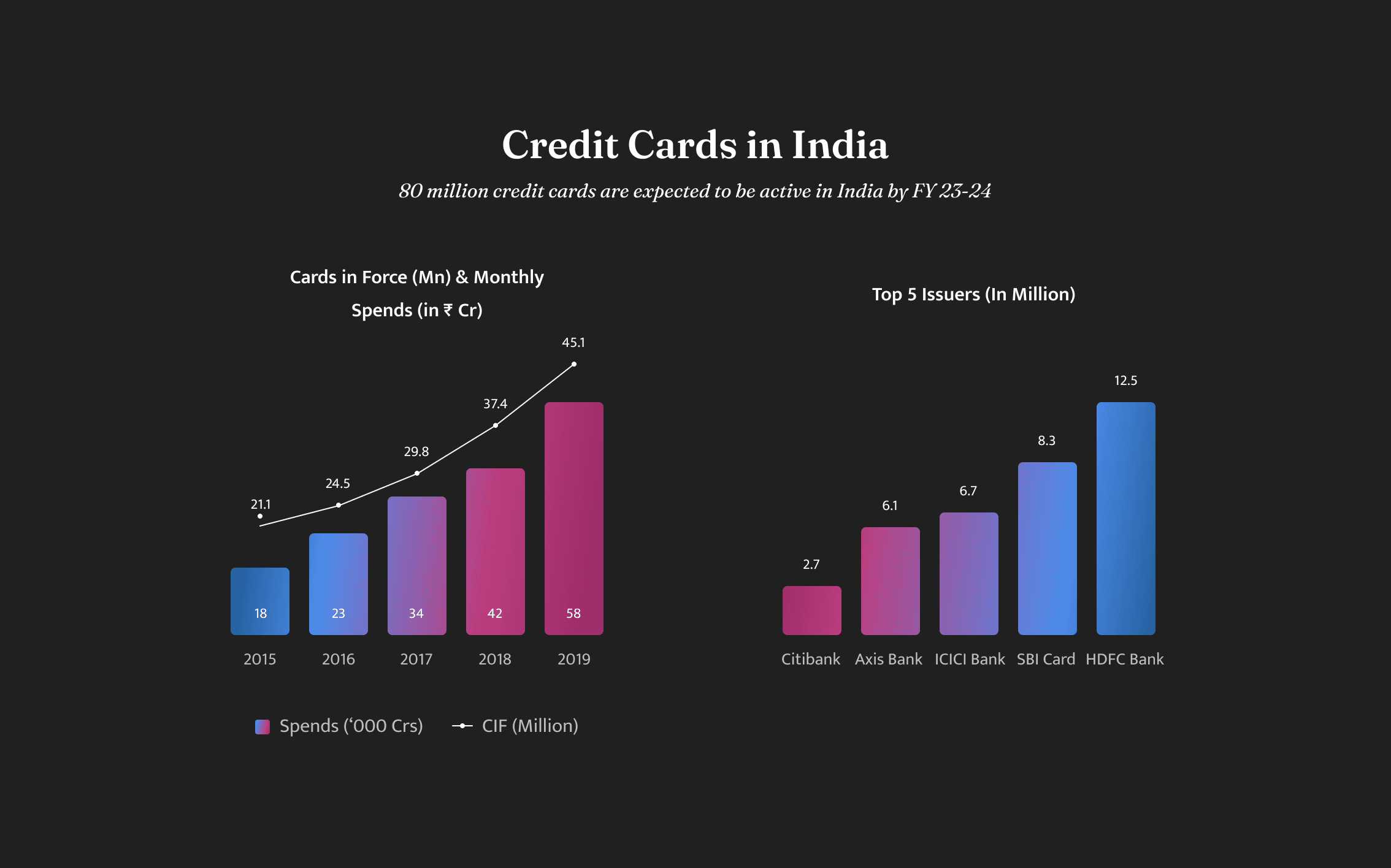
Credit Card Industry Overview
With 3%, India remains a highly under-penetrated market thus presenting a huge opportunity for disruption
The credit card ecosystem in India is growing rapidly, and there is immense potential for further penetration and acceptance. Although most Indians have accessed some form of informal credit, there are only an estimated 49 million credit cards in circulation. According to the data from CIBIL, about 220 million Indians are credit-worthy, yet only one third of this base has been tapped by formal financial institutions. Of this number, only 72 million are considered 'credit-active', meaning they have a live account with a bank or lending body. As such, there is a great opportunity to increase the number of credit card users in India and ensure that more people have access to formal credit - and thus the reason behind launching a credit card such as Flipkart’s
The industry itself is plagued by three key issues:
1. Conventional underwriting models leading to low approval rates - with most customers being ‘new-to-credit’, it has become increasingly difficult for banks to underwrite customers beyond a certain demographic, missing out on a major customer segment in India, which is driving the growth for the next decade. This means that banks are unable to tap into the potential customer base, and missing out on a key revenue source.
2. Limited distribution with heavy dependency on physical sourcing - which means banks have high cost of acquisition of customers and shrinking profit margin. Traditional physical distribution channels are labour intensive and require significant investments in terms of time and resources. As a result, banks are struggling to remain competitive in a market which is highly cost conscious. Thus, by offering credit cards using high-distribution online marketplaces such as Flipkart, banks can reduce cost of acquisition, and improve their unit economics.
3. Non-differentiated offering with commoditized customer proposition - means that the product or service is the same as what other banks have traditionally been offering, benefits that are well versed in the west and not adapted to the emerging consumer behaviors that have recently developed post the Indian startup ecosystem boom. This lack of differentiation means that banks are unable to capture the attention of potential customers. As a result, banks are unable to capture a larger market share, and are losing out on potential customers. To stay competitive, banks need to develop and offer innovative products that reflect the needs of the Indian customer base.
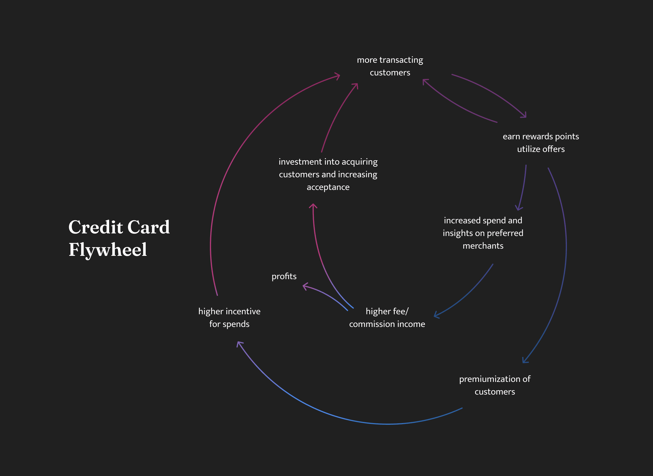
Flipkart’s Credit Card Flywheel
To truly understand the philosophy behind launching a credit card, it is essential to take a step back and assess the situation from a systemic standpoint; this will enable us to comprehend how this move can assist Flipkart in achieving its desired objectives.
Bottom Line Driver
With the ambitious target of issuing 40 million Credit Cards in India, Flipkart has the potential to generate a significant amount of profit from this partnership with card issuer Axis Bank. The three key components of this deal that allow Flipkart to benefit from the partnership are: firstly, a share of the per transaction fee for all transactions occurring on the co-branded card, secondly, an annual retainer fee for exclusivity in the partnership and thirdly, a customer acquisition fee for all cards onboarded through Flipkart’s channels. This collaboration on co-branded credit cards enables both parties to develop a monetization strategy that distributes their respective revenue sources in a fair and equitable manner. With this partnership, Flipkart has the potential to reap significant rewards, with the potential to create an even larger profit pool, as the number of co-branded credit cards issued increases.
Access to Credit
By leveraging Flipkart's data about purchase behaviors and other alternative forms of data, Flipkart has a greater ability to assess the creditworthiness of potential card holders than Axis Bank's existing underwriting models. This presents a unique opportunity for the bank to expand its customer base beyond the financially included population, while Flipkart can benefit from the second-order effect of boosting cashless payments. This is especially noteworthy, given that Flipkart has traditionally had a majority of its customers rely on Cash on Delivery as a payment method. While Cash on Delivery has been a major contributor to the success of ecommerce in India, it is now proving to be a huge cash burn for Flipkart. Therefore, cutting down on such expenditures and transitioning customers to digital payment instruments, such as credit cards, is crucial for improving Flipkart's unit economics and ensuring continued success in the future.
Loyalty
A loyalty and repeat purchase driver, Flipkart offers exclusive benefits that capitalize on the brand loyalty of customers. Customers who prefer to shop at Flipkart or use their exclusive Flipkart Axis Bank card can enjoy cashback rewards. This makes Flipkart a trusted partner for customers who want to make sure that they are getting the best deals, and are being rewarded for their loyalty when making purchases. This co-branded card system ensures that customers can take advantage of the various offers and rewards available, while also feeling secure that their loyalty is being appreciated.
The Flipkart Axis Bank credit card can benefit Flipkart in terms of increasing customer loyalty, encouraging customers to spend, and providing a reliable source of income. By offering a credit card, customers can benefit from attractive incentives and discounts, which can be used to purchase products from Flipkart. Additionally, they will have the flexibility of using this card to pay for purchases at other retailers who accept credit cards. This strategy ultimately provides Flipkart with an excellent opportunity to expand its customer base, as well as increase overall sales and revenues. All in all, launching a credit card is a wise decision for Flipkart, as it can benefit both the company and its customers in many ways.
Serving the ‘New-to-Credit’
Over the next five years in India, 500 million first-time internet users are expected to come online via their mobile phones.This is due to a combination of factors, including decreased costs of smartphone production, shifting localities for labor, increased rollout of Internet pipes, and an aspirational desire for access to the world wide web.
Thanks to advances in technology, Internet-based software can be made available to millions of people in a rapid and efficient manner, with access to the web becoming increasingly ubiquitous in many parts of the world. However, it's important to note that technologies entering these different cultural, social, and economic contexts often need to be designed with an understanding of the practices, values, and infrastructures of each area.
This is a population segment that has been technologically excluded, underserved, and disempowered until now and that’s who the Flipkart Axis Bank Credit Card was designed for.
Key Barriers:
1. Paucity of local language content on the internet -
Symbols and language from unfamiliar shopping experiences mean very little to this populace — and can be intimidating. The next 500 million users have not been exposed to a self service experience in shopping (using a cart, going to “checkout”). Their typical experience is walking up to a counter and being served by the shop owner who actively helps them decide what to buy.
Local language content is key in bringing the next 500 million users online as they are not native English speakers. 70 percent of Indians found local language digital content more reliable, according to a KPMG/Google study in May 2017.
2. User Interfaces and Experiences not adapted to their social/cultural context -
Building trust with the users is of utmost importance to capitalise on this demography. For that to happen, the first step is prioritizing simplicity and clarity in the communication about a product and its benefits. Universally-recognised signs & symbols can be used instead of text to drive conversions and actions - localising UI for cultural context; something I’d like to call as designing a Local Language Interface.
“The next 500 million users are conspicuous consumers, meaning that they are willing to spend more for a product or service (than the middle class for instance) if given added safety nets and quality services, which they have for the longest time been denied.”
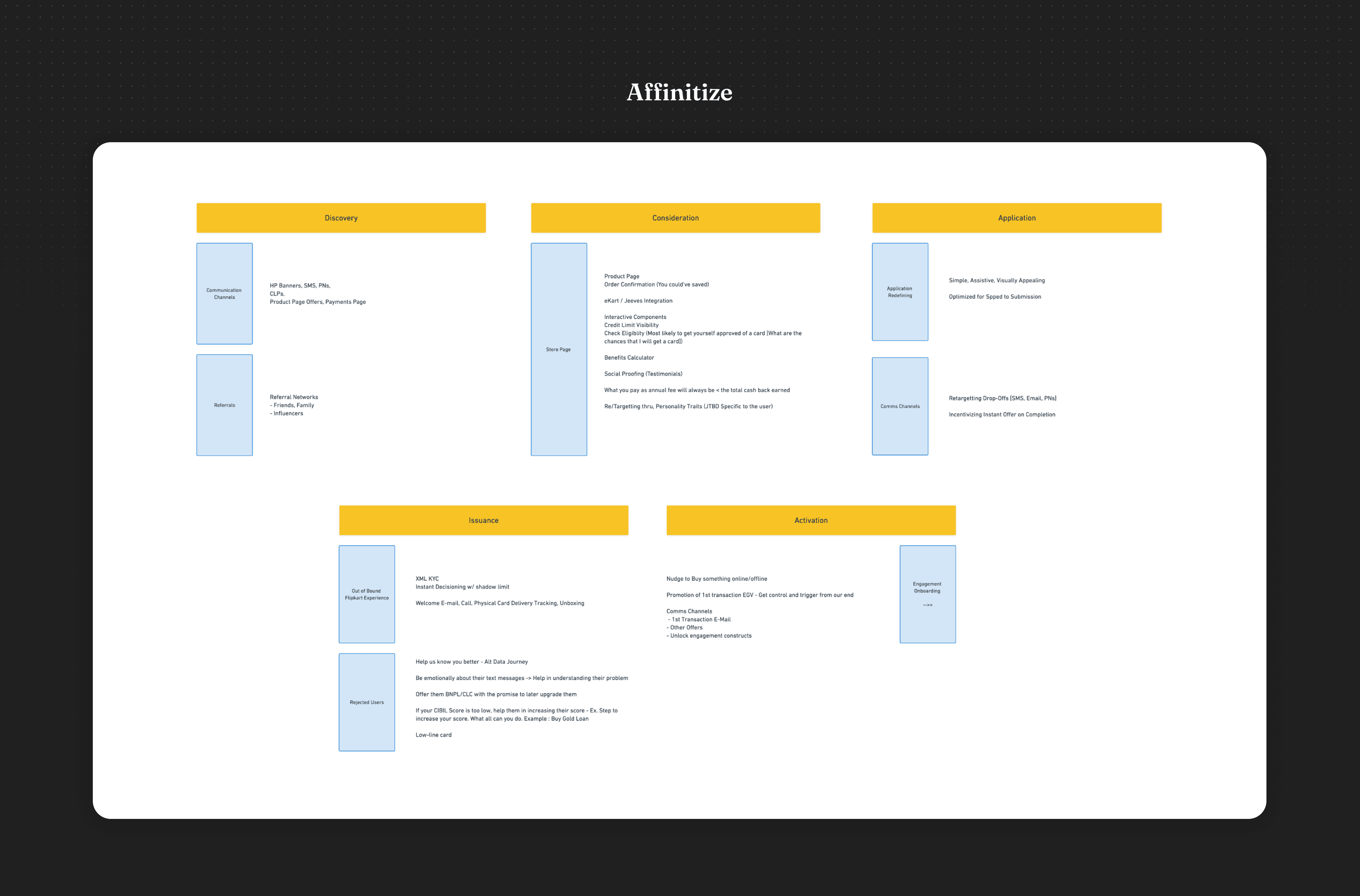
Kickoff
For the initiation of the project we prioritized our focus for the first six months on two things,
1. Awareness -
Establishing a strong recall of our credit card amongst all Marketing and Advertising channels was crucial for us in order to make it 'top-of-the-mind'. We had to make sure our A game was on in terms of product marketing, given the buzz generated by India's top consumer internet companies such as Paytm, Ola, and Amazon.
My role for this particular part of the project entailed deep collaboration with product marketers at Flipkart to ensure that the product positioning was well established throughout the lead generation funnel. I also worked closely with the creative team to create compelling communication pieces that would resonate with potential customers, helping to drive engagement and create a positive sentiment around the product.
2. Acquisition and Activation
The most critical part of our product was the lead generation, which is where our customers would land from targeted channels both on Flipkart and off-the-bound channels such as those offered by Axis Bank. This was to enable customers to learn more about the credit card benefits and start their application process easily. We made sure to provide our customers with a streamlined and secure journey so that they could feel confident in their decisions and trust us with their personal information. The application process was designed to be stress-free and simple, with no hidden fees or costs, so our customers could make an informed decision with clear expectations of what their credit card offers.
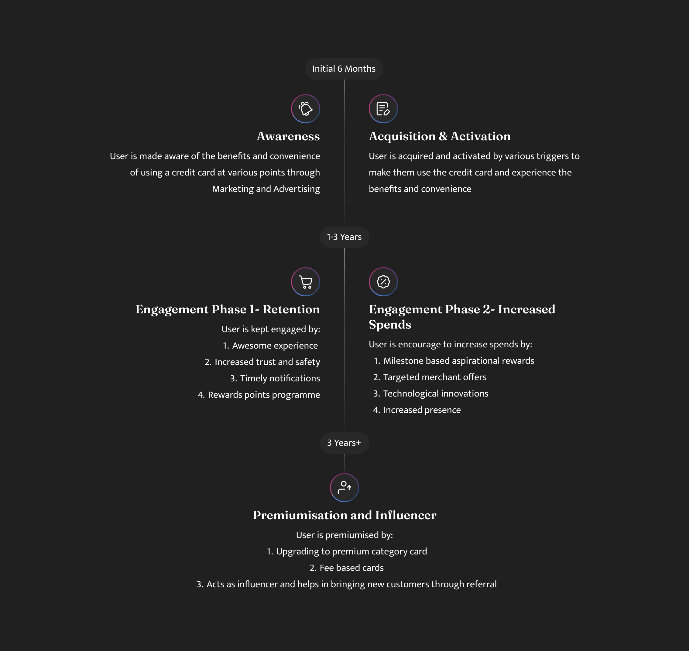
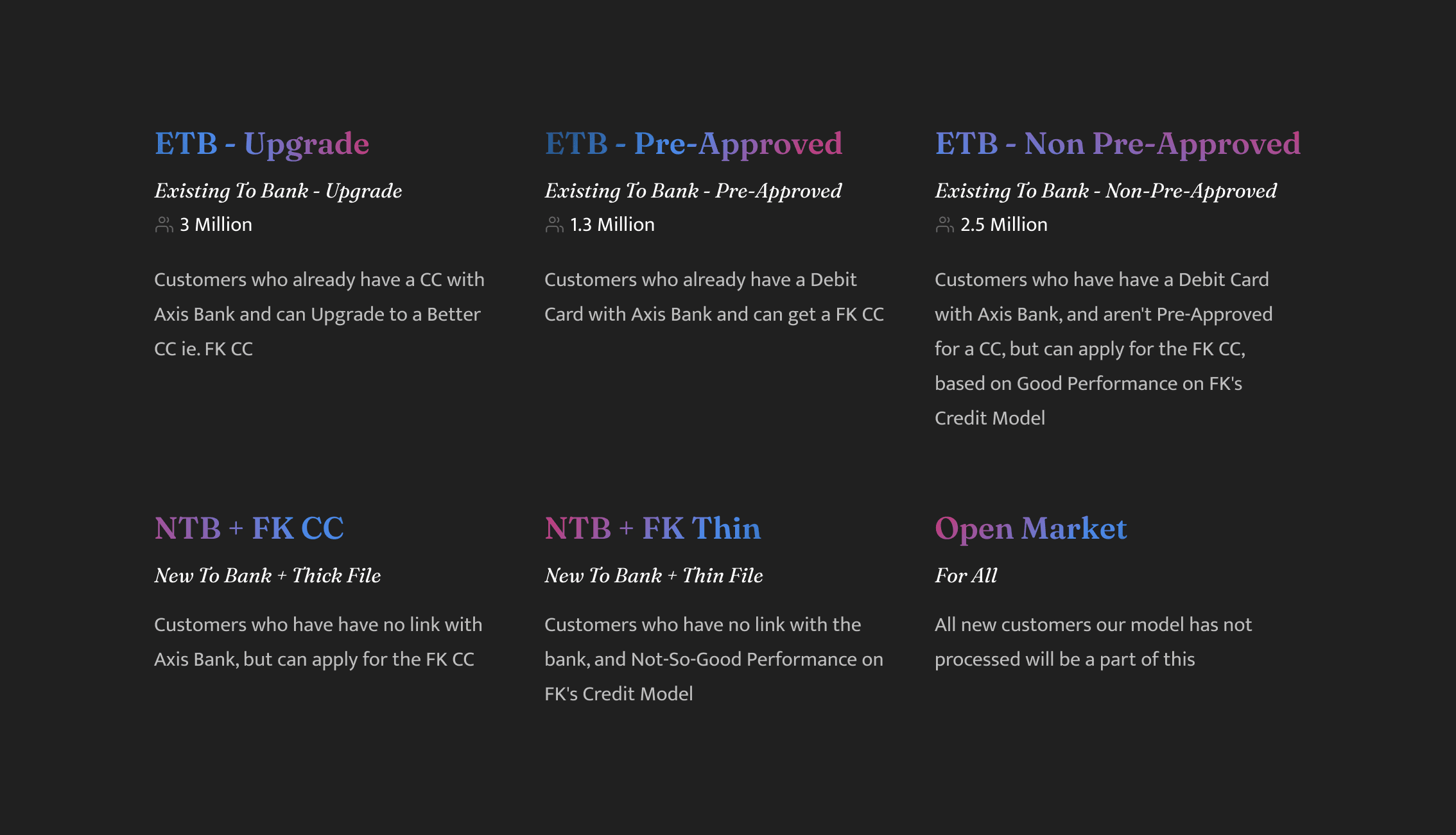
Our prioritization was also coupled with a deep analysis from the product managers that I was collaborating with. Since these user cohorts all had to be catered with special consideration in the application process for the initial launch, we took a strategic approach in selecting the customers we would initially target. We narrowed down our focus to the ETB-Upgrade group, who were already on Axis Bank’s books and were being offered a free upgrade to the Flipkart Axis Bank credit card. This well-segmented customer base was an ideal match for the stakeholders from Axis Bank, allowing us to significantly shorten our go-to-market time, and test our in-house credit modelling capabilities with an established and reliable partner. Furthermore, this collaboration enabled us to up scale our offering to a larger user base with a greater degree of confidence, since the working protocols between us and Axis Bank had already been firmly established.
Ghost Work
A lot of work that often goes into designing a product doesn't always make it to the public eye. These are often documents, Slack channels, brainstorming canvases where I spend a lot of time to get a better understanding of the problem. I look at competitors, stay up-to-date with the movements in the fintech industry, have brainstorming workshops with product managers, and prepare specifications for developers - all of which are critical parts of the process of delivering a valuable experience.
A lot of work that often goes into designing a product doesn't always make it to the public eye. These are often documents, Slack channels, brainstorming canvases where I spend a lot of time to get a better understanding of the problem. I look at competitors, stay up-to-date with the movements in the fintech industry, have brainstorming workshops with product managers, and prepare specifications for developers - all of which are critical parts of the process of delivering a valuable experience.
Efficient communication is essential for productive and satisfying relationships in the workplace. I practice what I preach.
Improving Processes and Fostering Collaboration
Look for ways to enhance the design workflow and collaborate with engineers and product managers to standardize processes.
Upholding Design Quality
Continually raise the quality bar by demonstrating solid craftsmanship, providing feedback, and actively participating in bug bash sessions for engineers.
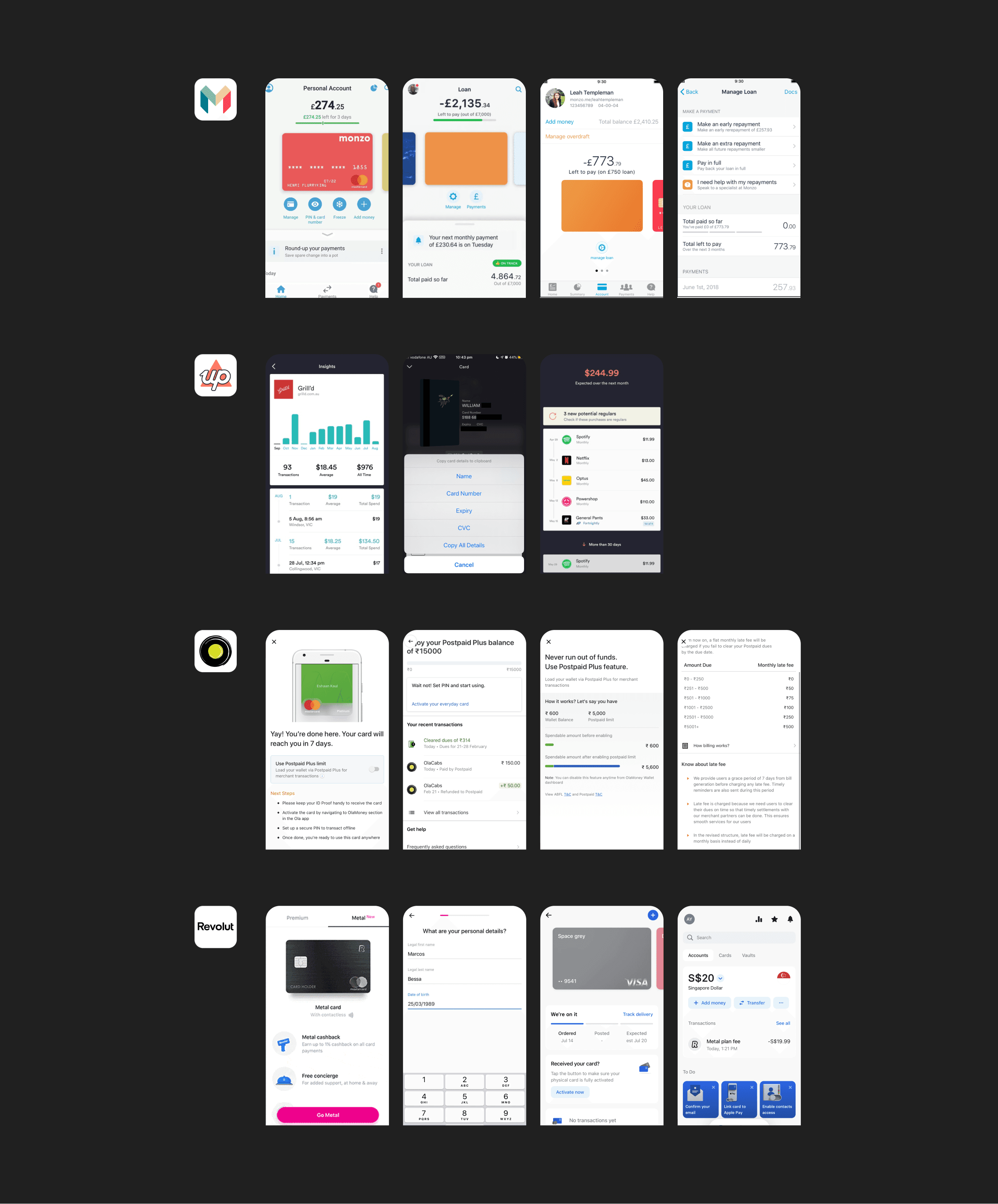
This is also where I get a lot of my inspiration. I've noticed that the best inspiration for the work I do rarely comes from the banking or fintech space, but rather products that exist on billions of devices and set the bar for mobile digital experiences. While they vary in purpose, their collective dominance in the landscape means they teach and familiarize patterns that people expect when using their phones. While acknowledging the patterns they establish, we also appreciate the balance between following them and doing our own thing.
How does TikTok allow you to react to content quickly and effortlessly? When explaining new features what language do these platforms use? When do they use visualizations? When do they use words? When is Snapchat playful and when is it serious?
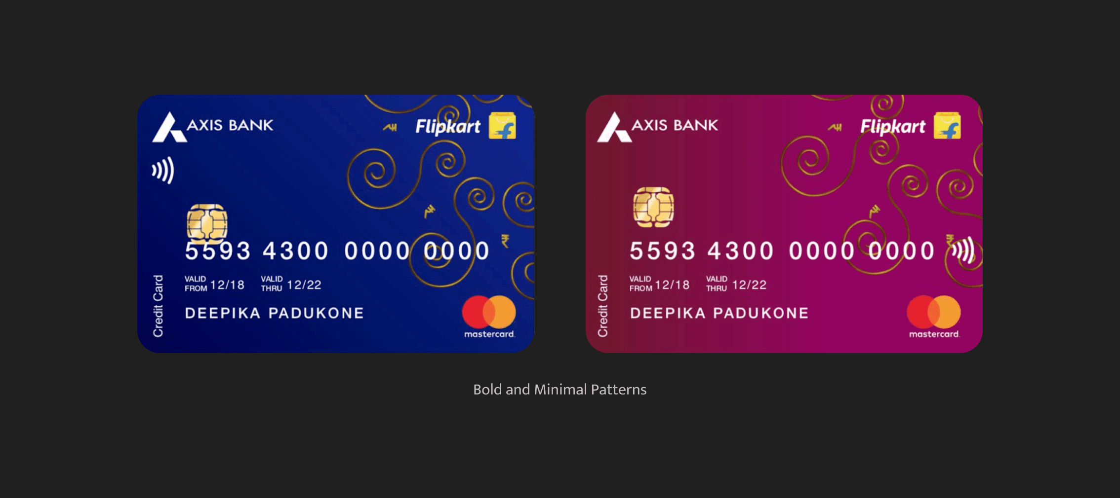
The Physical Connection - Card Design
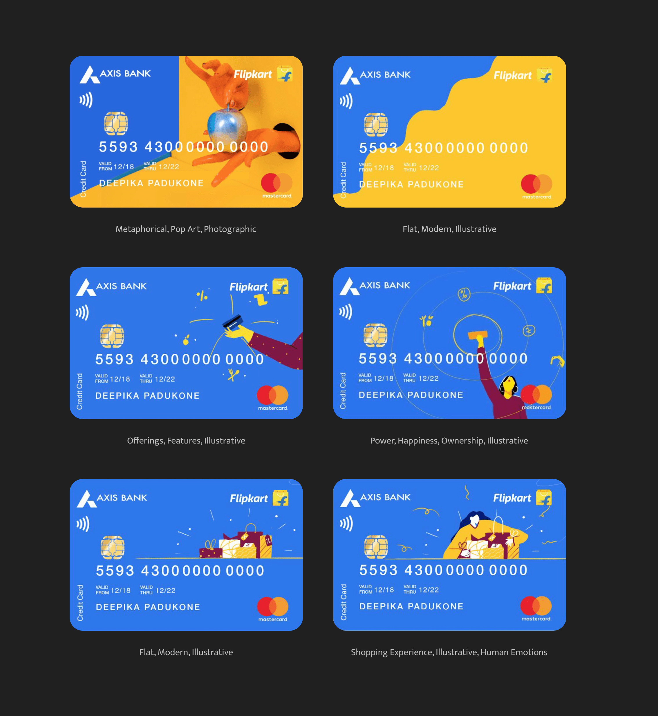
The first and foremost challenge we took on to ourselves was designing the physical credit card itself. Unfortunately, Card design wasn’t a priority for us because Axis Bank had already establish a steadfast design language for the newly launching cards, of which Flipkart Axis Bank Credit Card was among the every first of them. Regardless We took this as an opportunity to build a case for a new language which blends a physical connection to a fully digital product, with the introduction of this newly formed partnership. We knew that it was imperative that we own the form, tactility and visual appeal, optimizing them to create the best possible user experience.
We had established a core working group which included members from the product design team and a few co-workers from the marketing, creatives. The Flipkart Axis Bank credit card is our most tangible brand touch point and our goal was to elevate this experience creating a more intentional, multifaceted product offering.
Our research and understanding of credit cards has been instrumental in our conclusion that credit cards are a gateway to prosperity. We created elaborate mood boards to help us envision the yellows and gold materials associated with offers and rewards in India. Being a country that has a great affinity for gold, it is no surprise that this metal is considered a valuable investment. We incorporated elements such as discount symbols and offer tags to reflect this sentiment.
In order to bring culture to the card, we added traditional rangoli patterns to create a balanced look with repeated geometric patterns and bold colors in the foreground elements. This task was made even more difficult by the fact that Axis Bank's and Flipkart's brand identities had to be merged together, as they were both equal partners in this endeavor. To further emphasize the traditional aspect of the card, we added a unique pattern which was inspired by the Indian culture, to make sure that it stood out from the crowd. Additionally, we gave prominence to the gold and yellow colors to reflect the Indian affinity for gold and the idea of prosperity.
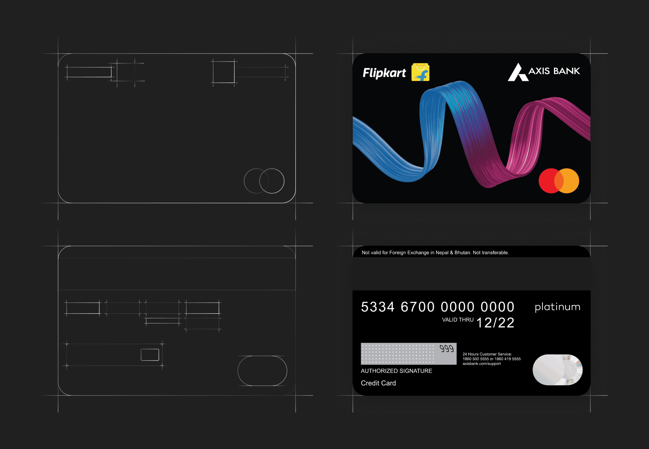
In order to deliver a memorable design that is functional, manufacturable, and within budget, it is vital that we communicate our vision with all major stakeholders, both internal and external, throughout the product groups. Unfortunately, setting up this part of the project for success necessitated recalibrating the card production plant, and the cost of doing so was something we simply could not afford, particularly with the competition putting pressure on our customer base. This meant that, instead of exploring these card designs, we had to shift our focus entirely on getting our application journeys in tact.
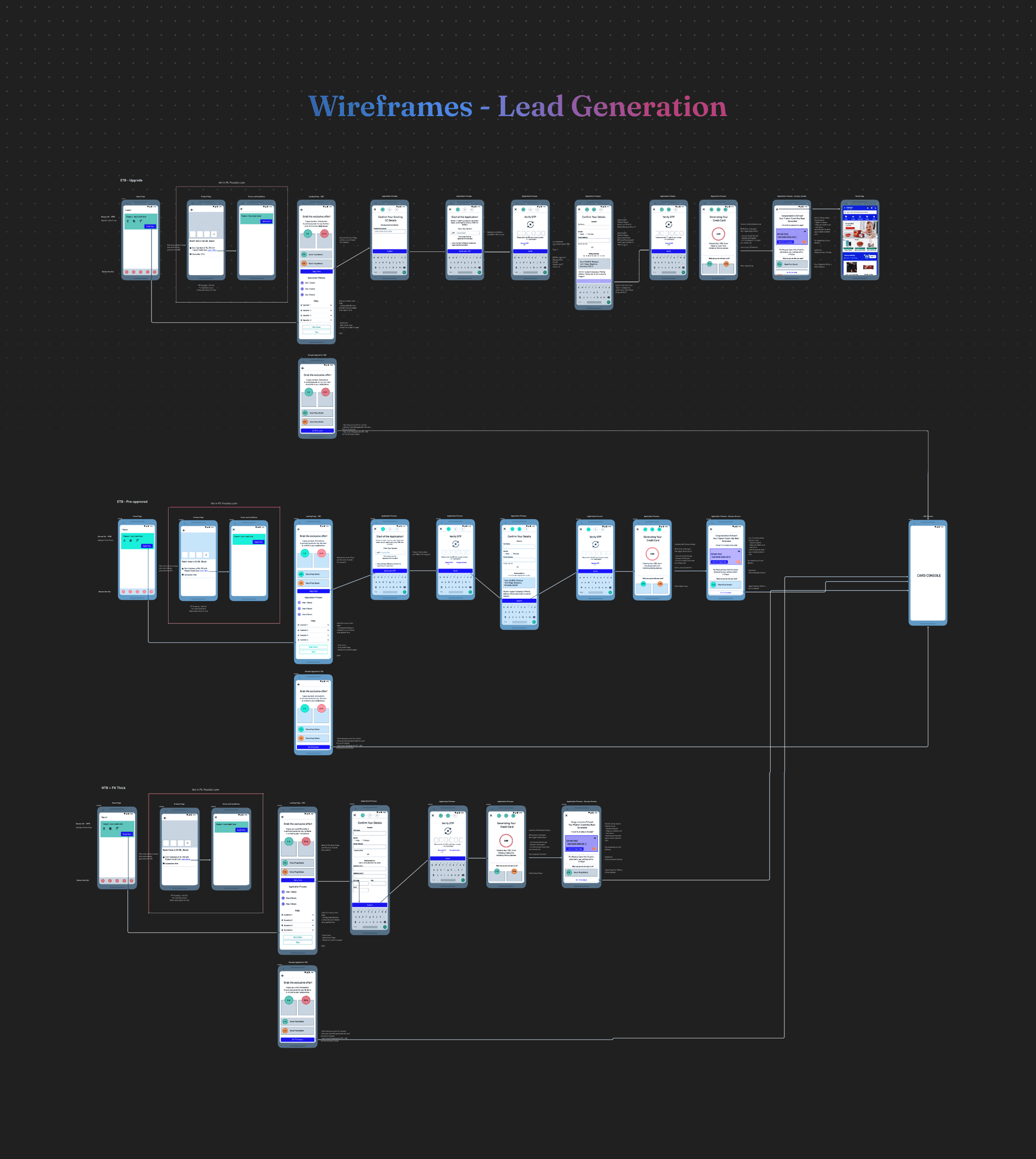
Step-by-Step - Lead Generation
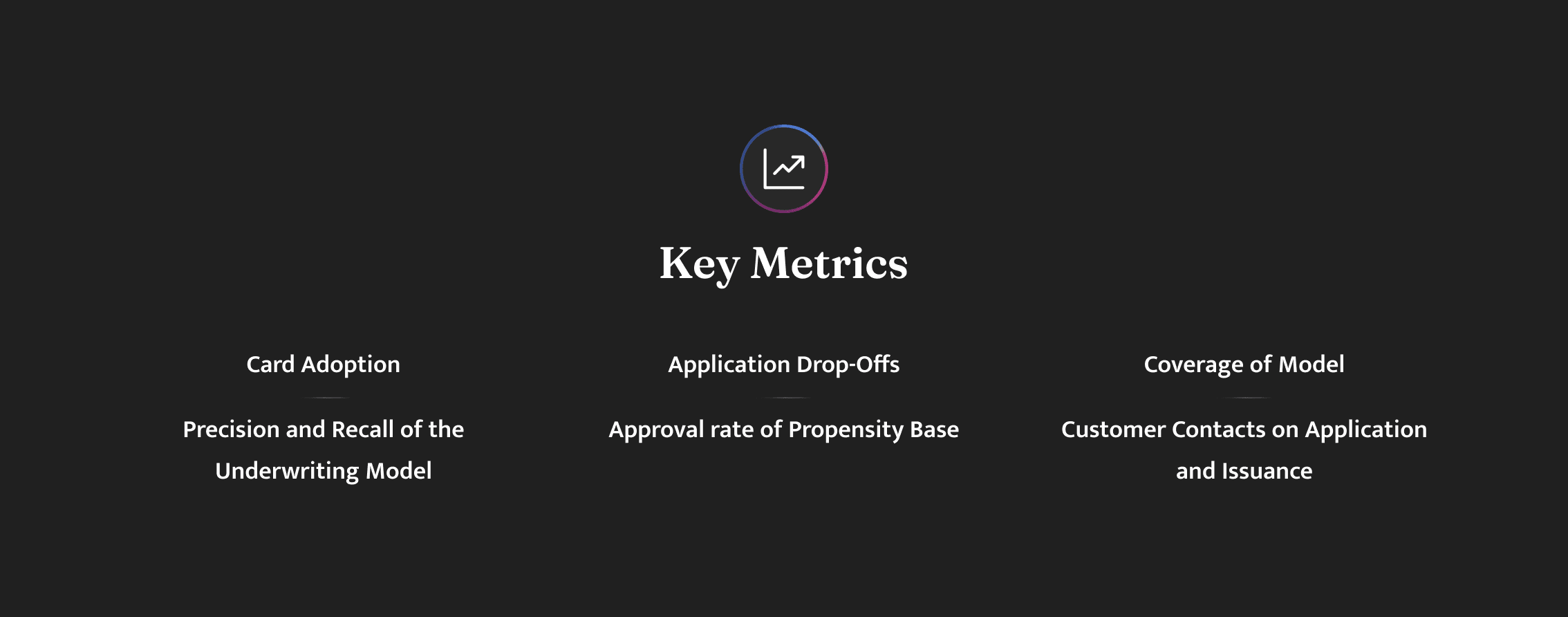
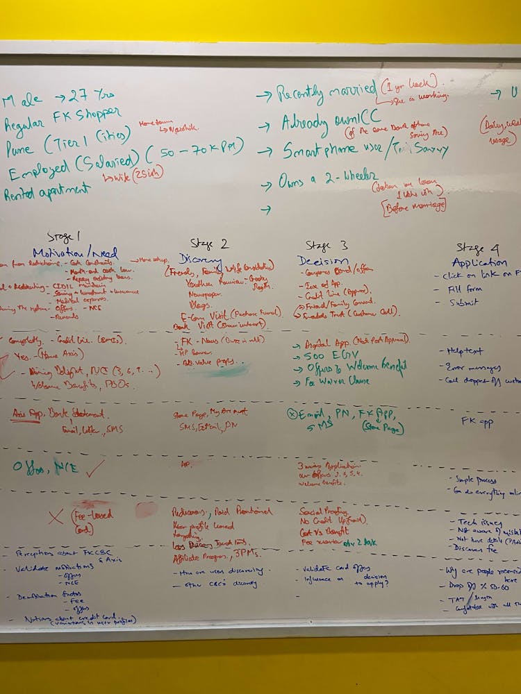
Prior to opening my favorite design tools, I underwent a rigorous onboarding process to the industry and learned about Flipkart's ways of operating. I paid strong emphasis on understanding the metrics that we would be tracking and their significance in the project's success. Since this project was tied to a financial value, it was essential that I formulate design principles based on the metrics. These metrics, listed below, cascaded across each level of the product experience and served as my guiding light. At first glance, some of these metrics may seem to have no effect on the designs I deliver, but I soon realized that each of them plays a crucial role in how the software I design interacts with our customers. I thus knew, I also had to emphasize and evangelize to the entire team of developers and product managers to prioritize each minute UI enhancement that was being designed.
When I am about to begin work on a completely new product, before I can start building, I need to figure out what it is that we want to do. Previously, I would have picked a random idea, seen what other players in the industry were doing and started designing every last detail of it. The produced output was often very supply-driven, as my inspiration Ryan Singer would call it. I often skipped the exploration of other ideas, and instead went all in on the first one that sounded okay and branched outward from there.
The “mockups” we came up with looked almost like a finished product. Every corner was round, every margin pixel-perfect, every word proof-read. In design reviews, people would focus on the visuals much more than the concepts behind them. The feedback I got was about sizes and colors instead of the underlying ideas. If I showed people too much design, telling them “ignore what this looks like” does not work. Because feedback at this level is not helpful at this stage, I was now doing fat marker sketches (or ‘the-fattest-marker-I-could-find’ sketches) instead. These are, unsurprisingly, sketches drawn with a fat marker.
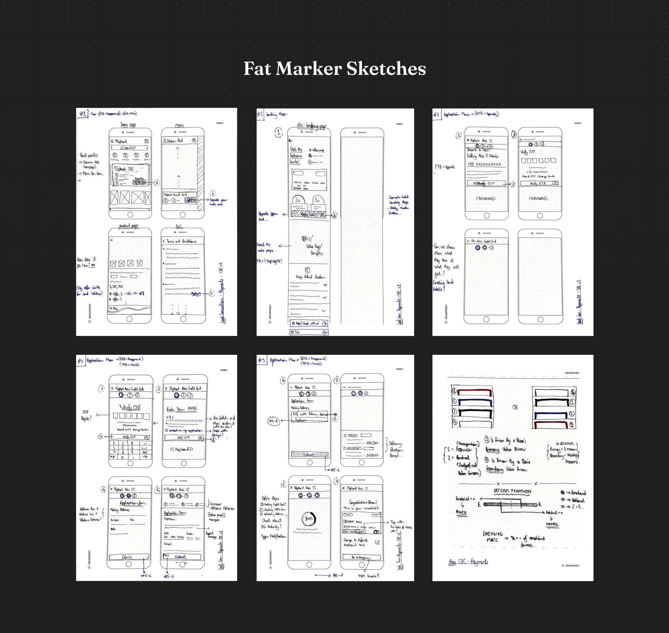
By focusing on explaining a concept, with no visual design at all, these sketches allow me to focus on the idea behind the product, rather than on its aesthetic. The core idea is to sketch the solution in "such broad strokes that adding detail is difficult or impossible". This approach then allows for more meaningful explorations of interfaces that actually try to solve user problems in a thoughtful and sophisticated way. I'm also able to ask the right questions and view the answer in the least amount of effort. This method of working helps me to create products that are conceptually driven, rather than supply-driven.
Setting the Narrative
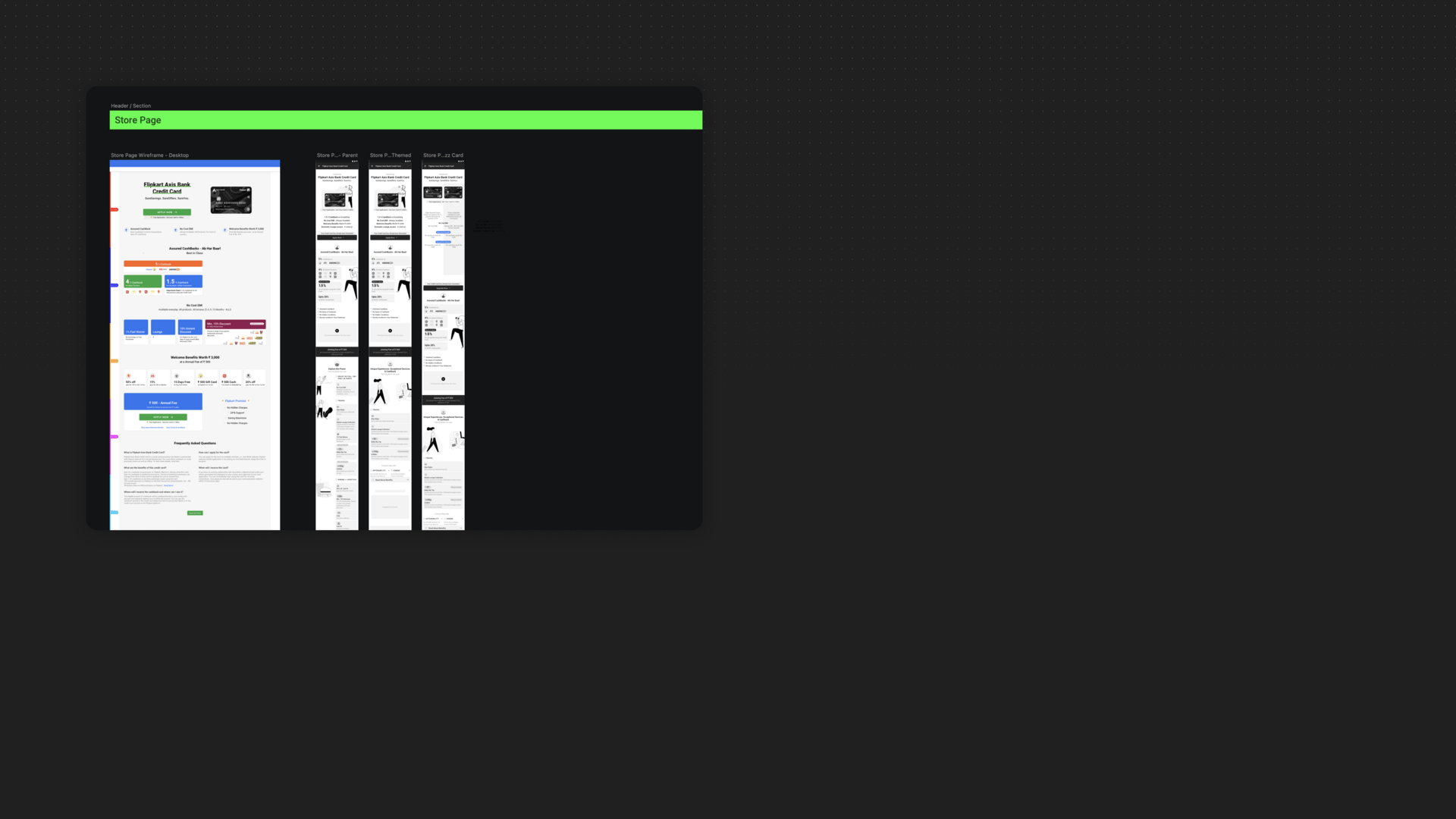
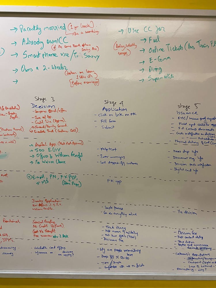
In banking, credit card eligibility application forms are used to determine whether a person will can be eligible to get a credit card. This presented a challenge to our team: How might we design a simple and clear experience for a form that needs to handle many different circumstances, and therefore the questions can vary widely? One way we approached this was by providing timely help and guidance to the applicant. Another way, was Determining the sequencing of questions and the design patterns we chose to break a complex form into digestible chunks of questions, simplifying the interface, and allowing the applicant to focus on smaller bits of information at a time.
The first task the team had to tackle was determining which questions needed to be asked. The challenge was structuring the complex eligibility application questions, which is often a mechanical process of entering personal and professional details. We used this information to access a customer's credit bureau score and tally it with our own internal credit modelling, based on user insights and activity on our platform. This wasn't as straightforward as it seemed. To do this, I worked closely with the product manager and Axis Bank officials to gain an in-depth understanding of the policies driving the information required from applicants.
Once we identified the questions we needed to ask and their corresponding policies, we created a massive flow chart, mapping the order of questions, conditions determining when a question is displayed, and any important policy context. We carefully examined each step of the process to ensure that the flow chart was comprehensive and easy to understand. We also took into consideration the possible responses of the user and how that might affect the questions that would be asked. In addition to the policy constraints, we defined several design principles to help shape the ordering of questions. These principles included making sure that the questions were logically ordered, that the questions were easy to understand and answer, and that they were presented in a manner that made sense in the context of the policy.
Our design principles were to tailor to individuals needs and minimize the effort needed to apply.
The first of our design principles was to tailor to individual needs. We knew that applying for a credit card can be a complex and time-consuming process, and wanted to make it as easy as possible. To this end, we worked hard to ensure that each customer got the best experience possible, tailored to their specific circumstances. This meant only asking the questions absolutely necessary, and providing the shortest possible path for each customer. To achieve this, we used customer cohorts to analyze the customer's needs and design an application that best suited them. To streamline the process further, we used “filter questions” to quickly determine whether a particular situation applied to the customer. This allowed applicants to skip entire sets of questions if they answered the filter question a particular way, leading to a quicker decision - either successful card credit issuance or rejection. This way, we were able to ensure that our customers got the best experience possible - an application process that was tailored to their individual needs.
When initiating a conversation, it is best to start with basic questions that the person is comfortable answering, such as their name, before asking for sensitive details.
The second of our design principles was to minimize the effort needed to apply. We wanted to make sure that the process was as simple and straightforward as possible, so that it would be easy and intuitive for our users. To this end, we structured the form in a logical order, presenting questions in a natural sequence. We thought of the form as a conversation, where you would ask questions in a certain order, just as you would in a real-life conversation. For instance, you wouldn't start a conversation by asking someone for sensitive personal details, such as their address or bank account numbers. Instead, you would ask some basic questions first, such as their name, age, and occupation. This way, the user would be more comfortable before being asked for any sensitive information. For specific cohort of users, there were a few exceptions to this principle, but ultimately we decided that convenience was the priority, as this would provide users with the quickest route to a decision. We knew that there was a compromise to be made here, but we were confident that it would result in a positive outcome in terms of the final conversion rate.
Arena of Creativity
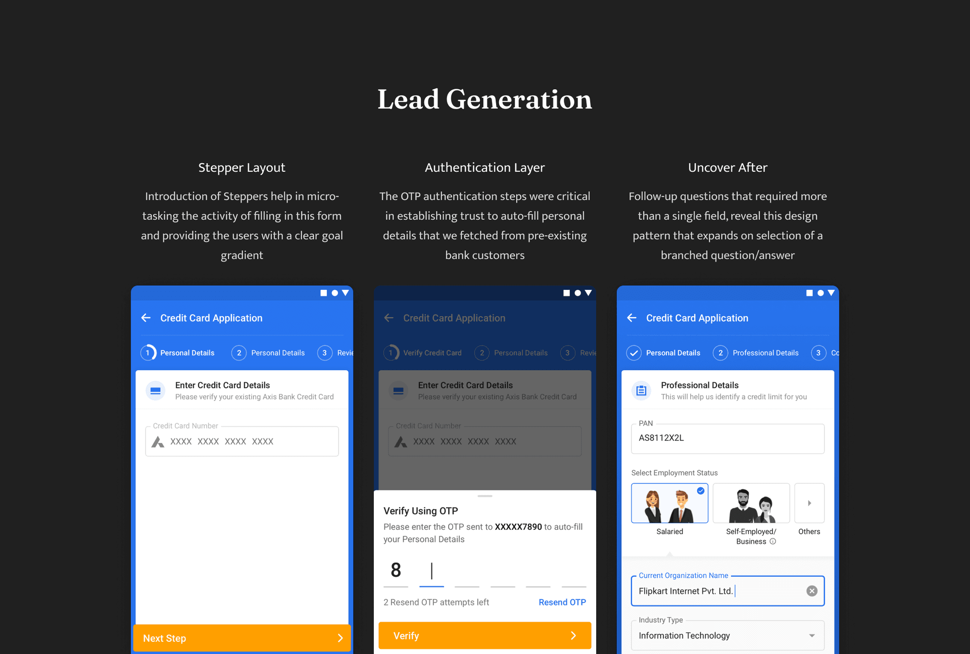
Within conversations we often flow from one topic to the next, and this same idea was used in the form we created. All related information was grouped together by topic, which allowed the user to quickly identify what section they were currently in. For instance, all questions related to an applicant's profession and income were lumped into the Professional Details section. To reduce the feeling of overwhelm that comes with filling out a form, I made sure to implement a stepper which helps to make the task feel more manageable and achievable. By having a stepper, it provides users with a clear goal gradient that guides them through the form. This assists them in completing the form with greater ease, as it gives them a sense of progress and accomplishment as they move through the application process.
Designing the steppers framework was laborious, primarily due to multiple layers of UI stacks interfering with each other. For example, the header space was owned by the core UI team, who had created an empty shell without any configurability of the header. This limited our creative freedom to the inner content area, making it a critical parameter for selecting which stepper designs to use in this project.
This might seem obvious, but it can be challenging to untangle multiple questions in order to group the information they’re looking for). In conversation, there are also natural pauses. We listened for these natural pauses in the questions we were asking, and this helped determine where white space could be introduced or where the form could be split into multiple pages. Thinking of the form as a conversation leads you, the designer, to think of questions as groups of topics. Within topics, there are smaller groups of information that you’re gathering.
We’ve found that a surprisingly good approach, where received wisdom would lean towards more grouping. I’d rather users get bored than get stuck, and ‘micro-sectioning’ really helps low confidence users not get stuck. Things are easier to understand and focus on, and errors are more easily corrected, while keeping the scrolling to a minimum.
We found the idea of "one topic per page" to be a useful framing when discussing it with stakeholders. We identified natural pauses in the conversation and split the application's questions across multiple pages when appropriate. Like every other fintech offering, we often found ourselves navigating the complex and ever-changing regulatory landscape, where we had to put certain rules on hold in order to accommodate the needs of specific user cohorts. This presented a unique challenge for us, as we had to ensure that we were still compliant with the regulations, while also providing the best possible user experience. We worked hard to make sure we were able to provide a seamless application journey for our users, while still adhering to the necessary guidelines and regulations.
Stairway to Success
Some people may be hesitant to the idea of "one topic/section/question per page" due to our industry's previous experiences and conditioning, which have led us to believe that more clicks and more pages are unfavorable (especially when it comes to e-commerce). However, this doesn't have to be the case. Of course, unnecessary clicks and unnecessary extra pages are a sign of poor design, but when pages are designed thoughtfully and with careful consideration to pacing and guidance, the user experience can be vastly improved. We were fortunate to have our usability research study results verify this point. Thus, it is important to remember that when it comes to page design, the number of pages is not necessarily indicative of the quality of the user experience; quality pages and thoughtful design are key to creating an enjoyable, useful, and efficient user experience.
When we began user research, we received a very positive response to the straightforward, step-by-step approach. Although it added more clicks, people noted that it made the process feel uncomplicated and effortless; there wasn't too much to absorb and process at any one time.
After having conversations with people from all levels of the industry, I have come to recognize that there is a case to be made for this line of thought. It is essential to optimize funnel points, however, not at the expense of users' comprehension and understanding. To ensure that users are not confused or overwhelmed, and that they can quickly find the information they need, one topic/section/question per page can be a beneficial approach. This approach can help create a more organized and user-friendly experience that can result in higher engagement and conversion rates.

A Pattern Language
With these objectives in mind, we sought to customize the experience to the individual needs of our users, while also aiming to minimize the effort required for them to use our product. Thus, we entered the design phase, where we investigated and constructed different patterns of question sequencing in order to better understand the best way to structure the questions for our users. We explored different options and sought feedback from users to see which pattern resonated with them most.
After structuring the form across multiple pages, we still needed design patterns to help us surface questions only when they were needed. We used branching questions, or conditional questions: if an applicant answered the question one way, they would go down path A; if they answered it another way, they would go down path B. The "one thing per page" pattern helps with this, but there are still times when a single page may have branching questions on it. To handle these scenarios, we used a different pattern: Uncover After.
The "Uncover After" pattern is likely one that many people are familiar with. This pattern reveals additional questions after a set of initial options. This pattern is useful when the follow-up questions require more than one field or are too complex to be included in another option. To ensure the pattern was used appropriately, we applied two constraints:
- - Limit the exposed questions to those that directly relate to the current page's topic. For other cases, the follow-up questions should be displayed on a separate page.
- - Limit usage of the pattern to questions that follow the selection of a radio, checkbox, or menu option. This prevents questions from being uncovered after an applicant types into a text field, which can be disorienting and jarring, like when someone interrupts you in conversation.
The combination of page jumping and the movement of the initial set of options, as the elements between them are revealed and hidden, can be disorientating. This often leads to people questioning which user interface element triggers which set of options.
To keep a close key out on this pattern, I recommended the analytics team to track the completion rates of these hub-and-spoke sections and, in user research, observe how applicants use it to ensure the pattern and choice architecture supports applicant needs and avoids potential pitfalls .
Engagement Is the Name of the Game - Card Console
Once the customer had been acquired, through the lead generation the game then flipped to thinking about means to lock-in the customer to the platform. Flipkart with it’s 250 million registered user base and a monthly active user base of 56 million customers wanted to play a bigger role than just being a lead generator.
The Industry was populated with traditional banking players providing sub optimal customer experience to their customers where Flipkart had an opportunity to provide an awesome customer experience and drive engagement using lower cost methods then previous pure play offer based engagement constructs. Cobranded Credit card here could played a crucial role in improved stickness to the Flipkart, thereby ensuring we tap into a recurring revenue earning stream through shared transitional fee and that is what the goal of card console was.
One-stop destination:
Flipkart is aiming to become a one-stop shop for everything related to their co-branded card, from the application and issuance process to the management of the card. The card console will be the ultimate destination for customers to track the delivery of their card and complete the necessary Know-Your-Customer (KYC) formalities. Furthermore, it will provide the customers with an overall seamless experience, allowing them to have an integrated view of their card activity, while also providing them with the flexibility to manage their card in real-time. It will enable customers to customize their card usage, allowing them to stay in complete control of their finances.Engagement:
Engage customers on Flipkart by making Flipkart the one-stop destination for managing CBC. Ensure there is a touchpoint in Flipkart for customers to know more about their card would make it certain that customer learn about the latest offers and regularly visiting the app to pay their bill from our platform.Drive Higher Consumption:
We had the opportunity to significantly enrich the customer data points by capturing detailed transaction information, thus providing us with a comprehensive digital graph of our customers. This would enable us to provide targeted discounts and come up with attractive milestone-based rewards in the near future; these measures would ensure that customers are able to derive the maximum value from their card's rewards and are incentivized to shop regularly from Flipkart and its partner merchants. Moreover, this would provide us with valuable insights into our customers' buying habits, allowing us to make data-driven decisions to provide them with the best possible shopping experience.
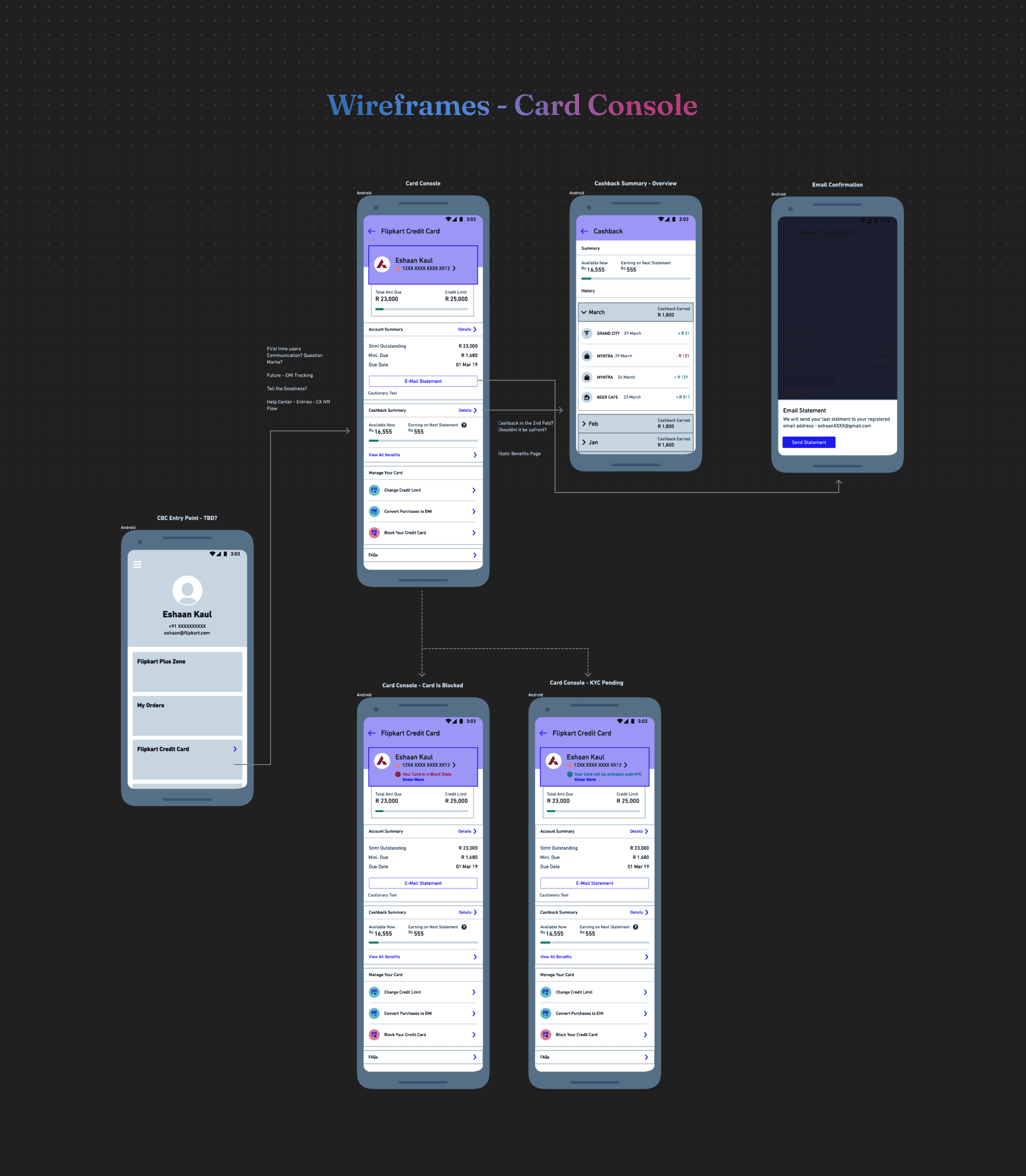
While initiating the ideation phase, we realized that existing banks have too much baggage to be able to see the future of banking for what it could be. This baggage has resulted in a lack of courage to re-invent themselves and to really innovate. This made us ask some important questions that emerged from that period: questions such as what could banking look like if traditional barriers were removed? What roles could technology play in creating a more efficient, secure and customer-focused banking experience? Could the banking industry become more accessible by introducing new, innovative services that would ultimately benefit customers?
Why don't all transactions have a timestamp and a merchant logo? When will my Know Your Customer (KYC) process be completed? Why are my payments to a particular merchant not grouped together? Why do I have to wait on the phone to resolve an issue? How can saving money be fun and engaging?
We knew that if we followed our noses and solved these user-centric problems, understanding the needs and wants of customers, and addressing those of many others that we would successfully win customers over. As the card console wasn't prioritized for the pilot launch, I took the initiative to continue carrying it forward with my peers, creating a single source of truth for all card management activities. I then handed it over to the new designer who took over while I shifted my focus to building the Advanz Platform.
Usability Testing
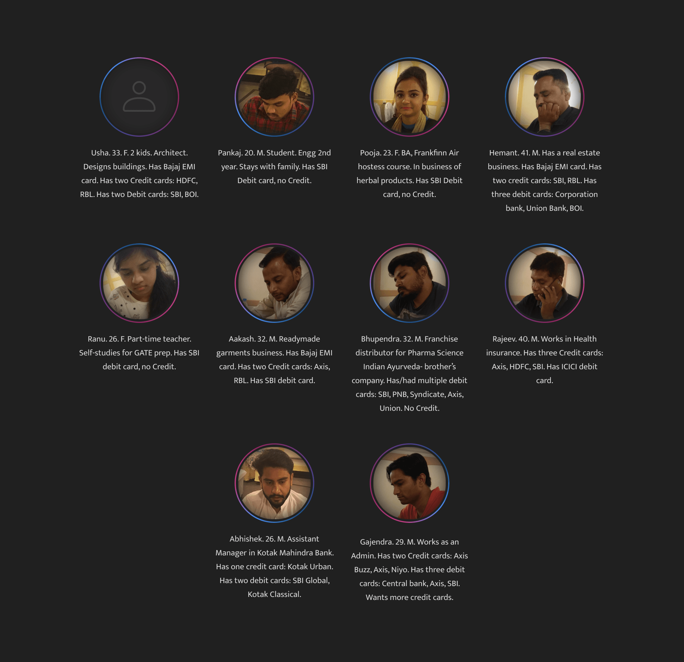
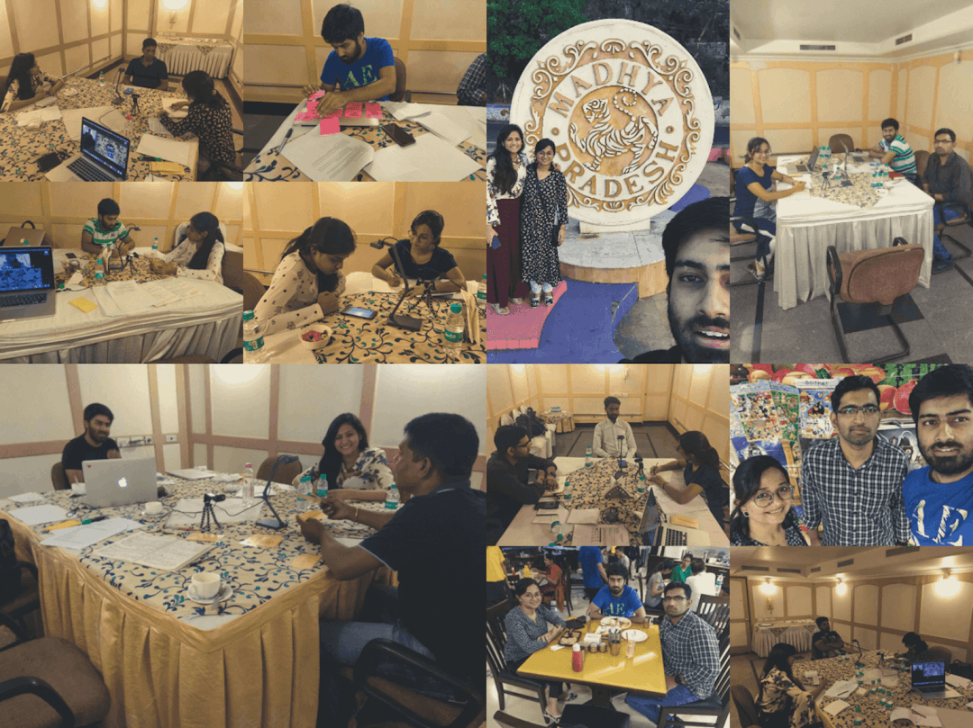
Prior to the launch event, we head out on the field to conduct research study trip. I along with a user researcher and product manger were in Bhopal, India talking to card holders (Credit or Debit), understanding their experience and pain points in applying for a credit card. Bhopal was selected as the city of choice primarily for three reasons:
- 1: This Tier-1B city had a demographic that exhibited characteristics of "new-to-credit" customers. This cohort, often referred to as "the next billion users”, typically display the following behaviors: mobile-first, price-sensitivity, safety concerns, offline mental models, a desire to explore and learn, using cheap phones, and following cultural norms.
- 2: We wanted to go to a geography that has demonstrated greater receptiveness for credit, with Flipkart's affordability models such as Cashless Credit (CLC) and the much-loved Buy Now, Pay Later (BNPL) being especially popular. Currently, the number of CLC users stands at 0.3 million, while BNPL has a significantly higher following of 5 million. Out of the 100 cities that have the highest number of BNPL orders, Bhopal is ranked 28th, making it a prime choice for our exploration.
- 3: Since we are collaborating with Axis Bank, it was important for us to test the waters in a city that had the potential to be an early adopter of our initiative. After examining the data, we determined that Bhopal, one of Axis Bank's top cities for sourcing credit cards, was a prime candidate for our pilot program. Additionally, we were pleased to see that there was a significant amount of overlap with debit cards as well, which further solidified our decision to test in the city. We were eager to see how our program would be received by the local community and had high expectations for our success.
The objective of the study is threefold:
- 1: To assess the potential of Flipkart's upcoming Customer Buying Cycle (CBC) by testing its value proposition.
- 2: To evaluate the usability of the CBC application process and identify any areas where improvements can be made.
- 3: To identify the benefits that resonate most with users, and use this information to create the most effective version 1 of the CBC. By understanding which features are most important to users, the CBC can be designed to give users the best possible experience.
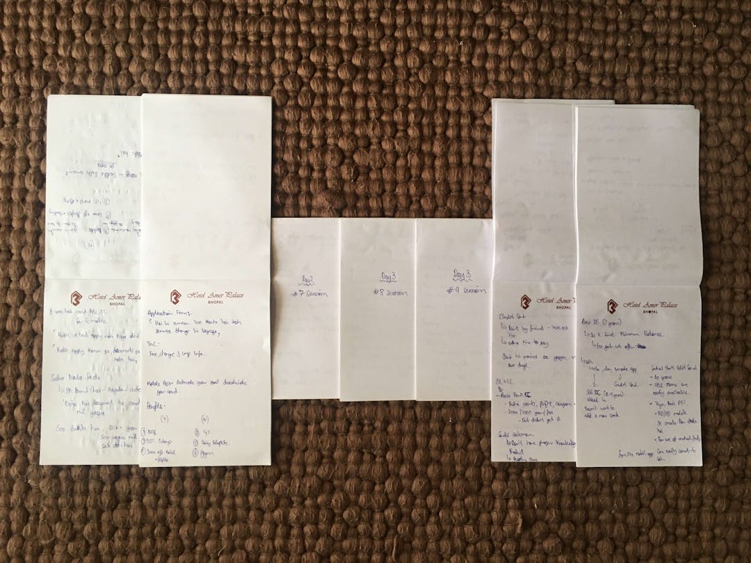
We conducted in-depth interviews with 10 users aged between 20 and 41 years old. The participants had a wide range of backgrounds, including students, salaried professionals, business owners, and self-employed people. To meet our three objectives, we conducted one-on-one interviews and guided them through the CBC application flow, followed by a card exercise. Each of the participants shared their perspective, experience and opinions about the application process. We also asked about their thoughts on the design and user experience, which gave us valuable insights into what could be improved. With this information, we were able to draw more meaningful conclusions and make better decisions.
For the first objective, we opened a discussion with the participants to understand their beliefs and experiences about the benefits provided by credit and debit cards. Afterwards, we conducted a Usability test, instructing participants to Think aloud and traverse one of four flows based on the four user cohorts we had shortlisted for the pilot launch. We observed how applicants interacted with the application journey to ensure our design pattern and choice architecture was well received. Finally, we concluded the interview with a Card exercise, allowing participants to rank the benefits.
Democratizing Access to Technology
Key Takeaways
Among the many insights that we received from our participants in our research study, there were several key takeaways that stood out. Firstly, we found that there was a strong consensus among the participants that the product had a positive impact on their lives. Furthermore, the feedback we received indicated that the product was easy to use, and that it provided an effective solution to the problem that it was designed to address. Additionally, we found that the product had a positive impact on the speed and accuracy of the task that it was designed to assist.
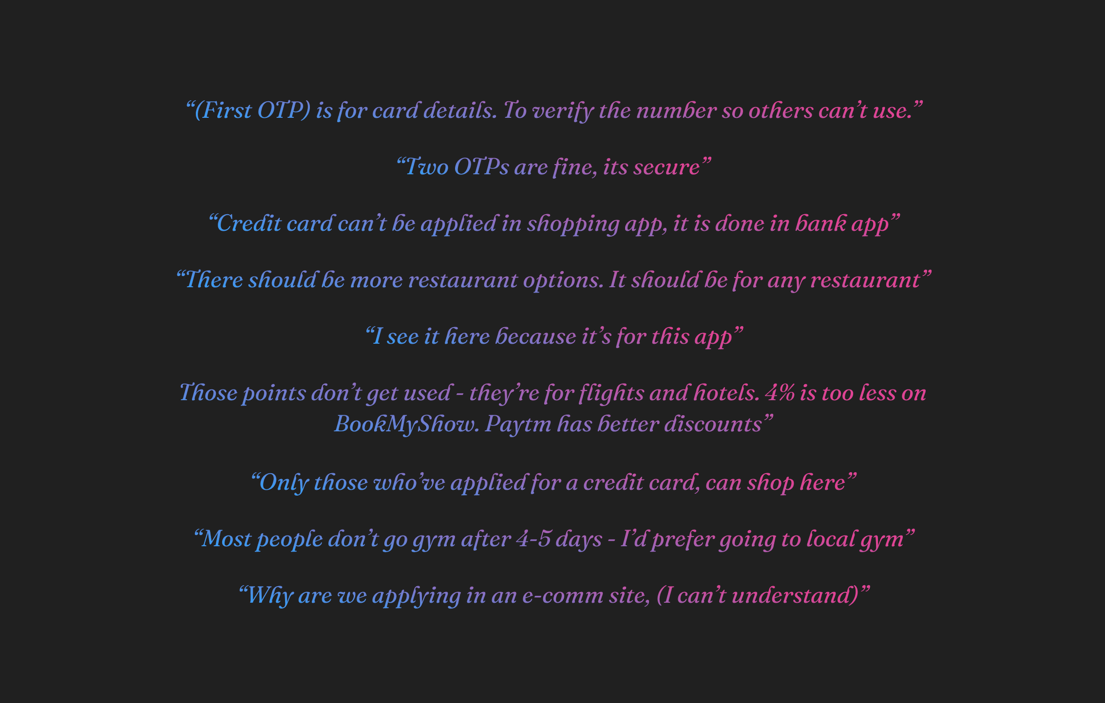
- 1: Benefits liked by most users were clearly outlined and described, and after they understood the benefits they were more than willing to opt for such a card. In fact, many users expressed that they found the benefits to be quite attractive, and that they would be more than happy to take advantage of them. Furthermore, they noted that they were confident that the benefits would be beneficial to them in the long run and that they would be glad they had chosen to use the card.
“This card has benefits of both ecomm and credit card.”
“It has better offers than my existing card.” ~ An existing Axis Buzz credit card user
- 2: One of the major drop off points that we had assumed in the application funnel for ETB-Upgrade journey was going to be the requirement of two One-time Passwords (OTP). Surprisingly, our expectations were incorrect and we noticed that the two OTPs were actually welcomed by the users, and for the right reasons. The two OTPs indicated the safety checks and security measures in place for their users when accessing their pre-fetch details. This was an unexpected but pleasant surprise, as we were able to ensure an additional layer of security for our users, and also make them feel more confident in their access to their personal data.
“(Second OTP): This is also important. Indicates that I’ve read the (terms &) conditions.”
“(First OTP) is for card details. To verify the number so others can’t use.”
“Two OTPs are fine, its secure.”
- 3: 6/10 users feel alright about annual fees.
“It’s alright, like a service charge.”
- 4: From applicants we heard, not surprisingly, that they are more likely to complete the form successfully (or at all) when we take on the burden of parsing policy and integrating the right tools and decision trees behind the scenes to route them to a lighter page with digestible chunks of questions relevant to their situation.
The Launch
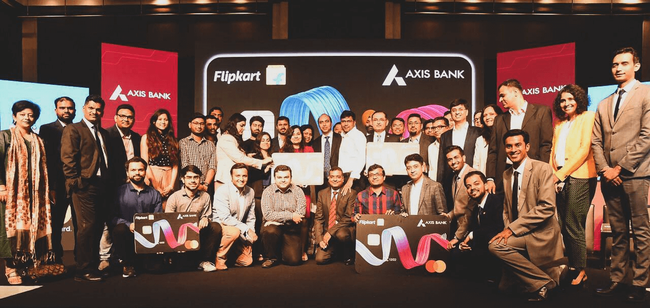
We launched the co-branded card and scaled to issue 890,000 cards in the first year of its launch, an impressive feat given the industry's standards. By February 2021, when I left the project, we had achieved our ultimate goal of 1 Million cards in force, totaling an impressive 30 million transactions out of which an incredible 4.5 million transactions were solely on Flipkart. This makes the co-branded credit card one of the fastest to cross two million card issuance, with a deep regional distribution covering over 18,000 pin codes and a presence in all corners of the country.
Mapping Emotions
After our launch, we conducted a series of phone interviews with our early customers to gain a bird's-eye view of their experience and motivations for using CBC, which had been recently acquired by Flipkart. Our intention was to gain an understanding of the actual user experience since CBC is still a relatively new product and there was not enough data from its product lifecycle or any prior research. We wanted to gain an overview of the perceptions and experiences of the initial users in order to plan out effectively for further foundational studies. Furthermore, we wanted to find out more about the users' initial impressions of CBC and whether they had any issues or feedback that needed to be addressed. This data would be invaluable in improving the user experience and ensuring CBC's continued success.
Reflection
Looking back, there are so many things I would have done differently on the project and the experience taught me so many lessons that have helped me to grow professionally.
Go down swinging
When making key decisions, it's important to optimize for the end-to-end customer experience, rather than just the product's pixels. This means considering the customer journey from the very beginning, such as when they are searching on Google or visiting our marketing page, not just the product page. Context is invaluable in this process.
We should strive to create products that evoke an emotional connection with our users. This requires an integration of form, tactility, and visual appeal, all optimized to create the best possible user experience. This plays a critical role in the product's success.
Swim against the tide
Designing Fintech products often involves challenging the assumptions and limitations of banking and re-evaluating them from a modern perspective. This is especially true when it comes to regulatory gymnastics - betting on regulatory loopholes for product-market fit.
Thrown into the deep end
Project management, interpersonal skills, and negotiation skills are all equally important tools in a designer's toolkit. I experienced a huge jump from a 60-person startup to a 1000+ startup. What had worked for me in early-stage startups didn't necessarily translate well to Flipkart-scale. Furthermore, working with internal stakeholders was a challenge for me, let alone dealing with external stakeholders from the bank.
Swim with the sharks
As a young designer, it was often intimidating for me to deal with bigger personalities in the room. People who asked tough questions and pushed to publish the best product. This was a new experience for me. My perspective on this situation has changed drastically over time.
Go swimmingly
As I worked on the project, I learned to prioritize tasks and balance the workload to ensure everything was completed on time and to the highest standard. I also developed flexibility and creativity in problem-solving, anticipating potential obstacles and planning accordingly. Unlike my past experiences, where communication was limited to a "shoulder tap," I realized the importance of staying in touch with the team throughout the project to keep everyone on the same page.
Special thanks to all the designers, engineers, and marketers who assisted me on this journey: Samir, Roshan, Soniya, Milan, Paras, Kunal, Anshul, Shivam, Shivangi, Nuvena, Mehul, Saurabh, Nishit, and Farah.